ST PAUL, Minn. — After skating for an entire season identified only by geographic location, the six teams that make up the Professional Women's Hockey League (PWHL) now have new names and logos to use on social media and merchandise.
The Walter Cup-winning Minnesota team will now be known as the "Frost" - not exactly intimidating, but accurately reflecting a meteorological condition fans will regularly deal with during hockey season.
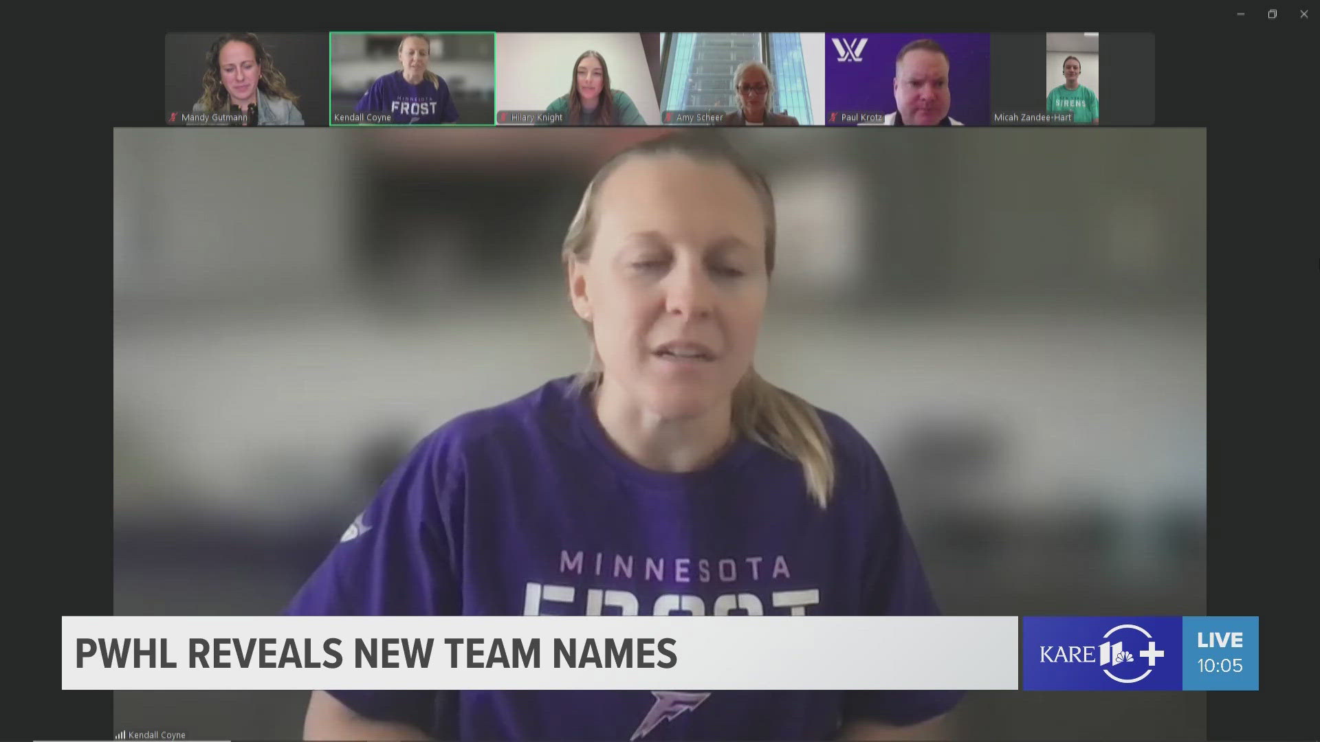
During a league press conference announcing the new names, Minnesota captain Kendall Coyne-Schofield expressed enthusiasm for Minnesota's new handle. "I'm excited for the fanbase in Minnesota, excited for the league and for hockey fans around the world," Coyne-Schofield said via Zoom. "The excitement of thinking about a couple of months from now, seeing fans in Minnesota walking around with Frost jerseys and filling the Xcel Energy Center with purple, just as they last year but now taking it a step further with the logo, the identity of the Frost, such a strong, bold and intense logo that I think a lot of people are excited about it, including the players."
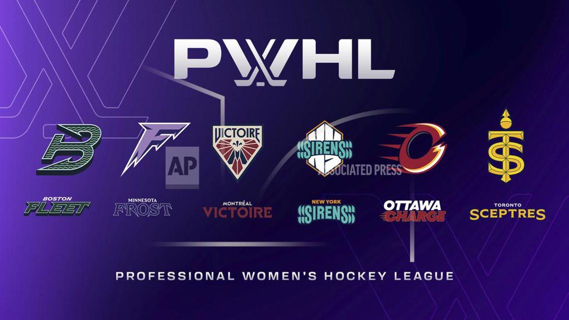
Minnesota isn't the only club with a new identity. Here is a complete list of new franchise names for the 2024-25 season.
- Boston Fleet
- Minnesota Frost
- Montréal Victoire
- New York Sirens
- Ottawa Charge
- Toronto Sceptres
The league was founded in late June of 2023 and play began on January 1 of 2024, leading the PWHL to hold off on team names and logos so as not to rush the process. It was around May - when Minnesota won the PWHL Championship - that league executives Amy Scheer and Kanan Bhat-Shaw set a 10-month deadline to have logos delivered to jersey suppliers so the skaters could be in new uniforms when the puck is dropped on a second season in December.
“Daunting for sure, but an absolute labor of love,” Scheer, the league vice president of business operations, told The Associated Press. “I think anybody who has worked in sports or is a marketer or brand person would look at this as an opportunity of a lifetime.”
Just don’t ask them to pick a favorite.
“I love all my children equally,” Scheer said with a laugh.
“I’m going to echo that,” added Bhatt-Shaw, VP of brand and marketing. “In real life, I only have one child, and it feels really nice to have seven now.”
Calling the process both stressful and rewarding, the two were tasked with filtering through hundreds of possible names - many of which were eliminated because the PWHL was unable to obtain rights holdings on both sides of the border - designing the logos and finding the right fit to capture the spirit of each market.
Another caveat was carrying over each team’s color schemes from Year 1 for continuity so fans who purchased previous merchandise didn’t look out of place.
As for the nicknames, Scheer and Bhatt-Shaw believe they speak for themselves.
- The Fleet represents Boston's maritime tradition, with a logo featuring a forward-leaning “B” in the shape of an anchor.
- The Minnesota Frost, the PWHL said, “embodies the State of Hockey’s deep-rooted love for the ice,” with the “F” logo featuring sharp icicle-like points.
- The Victoire name pays tribute to the team’s French-Canadian home, with the logo featuring a blue “M” for Montreal and a fleur-de-lis, a national symbol of Quebec.
- The Sirens are an ode to the New York's vibrant sights and sounds, and alluding to the goal horn, while the logo features the angular design of the letters “NY” to portray the Big Apple’s skyline.
- The Ottawa Charge reflects the Canadian capital’s motto, “Advance — Ottawa — En Avant,” with a logo featuring a large unfinished letter “O,” that also resembles the letter “C.”
- The Sceptres, the PWHL said, “embody Toronto’s regal history and commanding presence,” and reflect the Ontario capital also being known as the Queen City. The logo features a large scepter with the letters “T” and “S” incorporated into the handle.


The PWHL worked with New York City-based creative agency Flower Shop to assist in the process. Scheer and Bhatt-Shaw also bounced ideas off a group of PWHL employees, who would vote on potential names, and the two spent last season consulting with fans to get a feel for each market.
Proud and connected as they are of each name and logo, both are aware their choices will spur debate — and criticism — among fans.
“Everybody’s going to sit behind their computers and they’re going to type good, bad and ugly. And that’s OK,” Scheer said. “I feel the process we went through was very thorough. We feel very confident that we’ve got six great names that are bold, they’re confident, they’re strong, competitive and, I think, they resonate with the markets that they’re in.”
She took exception when informed the Fleet “B” logo could also resemble a “W” when turned on its side in what some might perceive as an homage to the NHL's former Hartford Whalers.
“That `B’ is a sideways anchor and only a sideways anchor,” Scheer said.

