MINNEAPOLIS – As word of Major League Soccer expansion grew louder in Minnesota, soccer faithful from across the country started taking notice. Yes, they noticed the passionate fan base yearning for Wednesday's announcement. Yes, they noticed the vision and ambitious plans from ownership. But the very first thing they noticed? The loon.
"We didn't want it to just be about Minnesota, we wanted it to be of Minnesota," said Brad Surcey, design director and partner at Zeus Jones, a Minneapolis-based company.
In 2013, Zeus Jones was chosen to help re-vamp soccer in the state by giving Minnesota United FC a new look. "There's a lot of places around the country they could've asked to do the work, but this meant a lot to us – making this for a local pro sports team," Surcey said. "We wanted something classic and timeless, even if they (MN United FC) were to move to MLS."
On Wednesday, MLS awarded Minnesota an expansion franchise. In 2018, MN United FC will move from the current North American Soccer League, to Major League Soccer. An ownership group is still being assembled. They have expressed interest in keeping the current name and logo, however that is a decision ultimately made by MLS.
"We got to figure all that out. I know the fans, the Dark Clouds, I'm sure are very committed to that name, but like all new teams that come in, we've got to go through colors and brands and speak to the fans and figure out if there's anything that mike work differently or perhaps even better," said Don Garber, MLS Commissioner.
Some in soccer have already weighed-in. The MLS community on Reddit voted it the 'Best Crest'.
Soccer legend Alexi Lalas tweeted the MN United FC 'will immediately have the coolest logo in the league.'
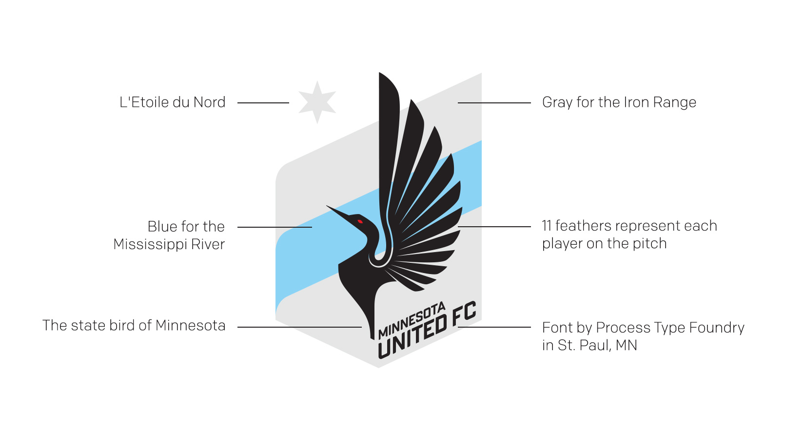
There's a lot to this loon. The state bird features 11 feathers in the crest, representing each player on the pitch. The gray background symbolizes the Iron Range. The blue stripe is for the Mississippi River. L'Etoile du Nord, or the Star of the North, is also represented. The font for MN United is also local, designed by Process Type Foundry of St. Paul.
"We've been very happy to see this come to life over the past couple of years and we look forward to working with the club on some new things in the coming months," Surcey said.